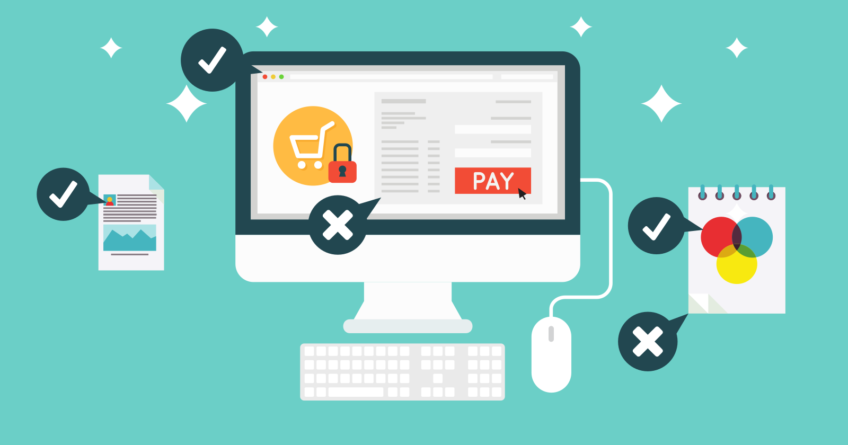
In the ongoing trend of the present time, ecommerce website development is dominating the internet. Ideally, a good e-business web design is extremely important for turning your website visitors in to your regular customers. If taken seriously, it could offer you the wonderful chances to build your brand value and helps in connecting with the customers. It means the more you connect with the customers the better the chances to know their requirements. However, sometimes it becomes frustrated too for the customer to buy anything online due to the poor implementations of designing and development. Let us have a look over some of the biggest blunders which you can avoid while making an ecommerce website –
Poor Site Navigation & Structure
Poor navigation is something which impacts straight away the decision of either to buy or not. It discourages the customers to leave your website within the seconds. It should be easy for your customers to navigate. Avoid using too many colors, font size and lack of buttons. Implement the best navigation practices.
Irrelevant or No Product Description
If your description doesn’t match the actuality of the product or if it is written but unnecessary then you are not going to get any benefit from it. A product description is one of the important parts of a content which should never consider for granted. Neglecting it might cause customers to exit.
No Search Engine Optimization Strategy
Having a good ecommerce web design doesn’t fulfil the whole purpose of a website. Unless your site comes in the search results of Google, chances become less you will get the visitors. You should have a strong SEO strategy in order to get appear in the first pages of SERP.
No Responsive Design
It is believed that approx. 61% of the purchases come from the smartphones and for sure the numbers will grow. Your website needs to function well in terms of responsiveness. If your website is older with no mobile compatibility then you need to make it responsive as early as you can.
Complicated Check-Out Process
After the successful purchase from your website, if a customer is facing problem in checking out then it is not a good sign. The customer should be able to check-out quickly within just a few clicks. In order to abandon his/her purchase ensure to provide check-out on a single page.
These are some of the instantly picked mistakes that are done by most of the developers. Considering these tips by ecommerce website designing Development Company can bring you the expected results you wanted to.


Nice Post I found It very Helpful!
Superb Blog Keep it up…
I’ve found this information very helpful as many people can get help from your blog.I really appreciate your research and blog.Waiting for your next posting.