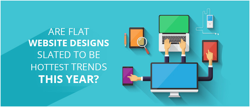
The new and emerging trends in world of website designing has led the managers to rethink about their strategies. Many of them have switched from merely building and designing websites to have third dimensional elements and visual depths resembling single surface viewing experience. Amongst many, one of the quite popular trend that popped up across the web recently is Flat Designs. But the main concern is whether it is still going to make waves or will spread like wildfire to burn itself up?
Let us have a look at why the website designs model of flat structure is trending and what it means for your website?
Flat is no more boring but functional
In order to get a better understanding of what actually flat website designs are, you just need to understand the logic. With the flat designs, you will not see the usual styling elements that are prevalent other ways like shading, gradient, glow effects, subtle textures etc.
Instead of being attractive and impressing the users with fancy fonts and designs popping out of your pages, the flat designers prefer to take a minimalistic approach that will value functionality over fluff and fanciness. The computer savvy consumers these days are looking for some responsive brands that do not need to hold their hands to navigate through a colorful gateway.
When the online forums, drop down menus or regular share buttons appeared firstly, people were unfamiliar with the design elements and required the website to help them. But no more is the case similar now. These days, people know how to get around a website intuitively and thus, simplicity of flat designs contributes to their popularity.
Flat Is a Step Backward Toward the Future
History repeats itself – This is what we have seen for decades. Whether you talk about the hairstyles, latest fashion trends, web designs or marketing, the idea of flat website designing is not new. Moreover, it just looks like a fresh take on the attitude and tone of 21st century, one that echoes with millions of people using mobile devices and smartphones.
When speaking about mobility, these small screens demand one to have larger images with bigger text, where both are the key elements of flat designing. The rising use of responsive designs for mobile UX has necessitated the need to implement two dimensional websites which come with unique shapes and colors to get realistic look rather than moving GIFs and dimensional graphics.
In addition to effective responsive designs that come with sleeker experience, quick upload time is yet another major benefit that flat designs offer to a website.
Flat compliments User Intelligence
Early WordPress webpages and blogs were built as based on beliefs that the user does not know how to use a website or web. In a world, that is full of people having their online experience through phones or tabs at a small age, these days it is safer to assume that people already know what to do, where to find menus, where is the CTA button and other. With this mindset, it gets easier to see why the grid layout, content headline separation and simple fonts are getting precedence over designer labelling and texture to guide the users around the website.
Totally User Friendly, Mobile optimized and responsive, the blog page for Pandora deserves accolades for including all the essential elements of flat website designing. It is a case simplicity personified- full of beautiful images, relevant content and require white spaces. Even the home pages of the website contain all the information that the first time visitors and followers require to create a stations above the line, with no scrolling needed.
Flat Design: Passing Fad or not?
According to expert web designs, as high as 68% of the web designers believe that flat designs are going to stay. Though they still believe that the design concepts will evolve constantly as it used to be with the laptops and smartphones, the users of these days demand agile, responsive and forward thinking about the brands that meet their expectations through easy to use techniques and tools and enhancing the daily lives.
When done building your website, you need to answer the demands to thrive and stay competitive in fast paced market. Thus, you can review your pages with critical eyes to make sure that web pages are simple with cleaner lines and superb content.
The moment technology or the designing model gets stale, it will simulate innovation and just like most of the trends, this one, too comes with its expiration date. However no one exactly knows how it will happen. Thus, so fat, it is better to stay with it now. Stay competitive in this rapidly evolving and changing marketplace, which is not that easy. Remember that despite you having the most user friendly, responsive, beautiful and simple website, you cannot serve your customers until you have a good team and reliable web hosting partner.


